
As I age, the number of health checks is endless. As my birthday rolls around again, this 72-year-old gal is tired of doctor offices, but I know early detection and pattern recognition of illness is important.

However, when it comes to supply chain excellence, companies spend a lot of money on improvements, yet I find that most are unclear on definitions and how to conduct supply chain health checks. I dedicate this blog to those trying to improve supply chain performance.
An Orbit Chart as a Supply Chain Health Check
I find an orbit chart to be a powerful tool for understanding the “health” of a supply chain and its potential for improvement. The supply chain is a complex, non-linear system with trade-offs. The relationship between trade-offs varies by industry, region, and size. The orbit chart is a diagnostic we use in the Supply Chains to Admire work. (Stay tuned, this year’s report is on target to publish on June 23rd.)
In developing the Supply Chains to Admire analysis, we start with a well-defined peer group. The reason? Each industry has a very different potential. Market factors shape the potential over time. The goal of the Supply Chain to Admire report is to beat the industry peer group while driving improvement. Sounds easy, right? Not so fast. Year over year, only 6-8% of companies meet this standard.
The analysis is based on reporting in public markets. We use a syndicated data feed — Y charts — to account for differences in reporting, currency, restatements, and aggregation across markets. (For example, Unilever reports in twenty-four public markets.) We start pulling this data in March and gradually eliminate outliers. It takes us a couple of months.
The analysis is for a ten-year period. The reason is simple. In my experience, it takes a lot of time and energy to turn a big ship. A transformation of a small company might take three to four years, but the transition of a large multinational can take six to ten.
What Is An Orbit Chart?
Definition: An orbit chart is a visual representation of relationships, influence, or movement around a central point. The term is used in several fields, but the core idea is the same: objects “orbit” around a central entity.
Using the Orbit Chart Technique to Better Understand Supply Chain Excellence
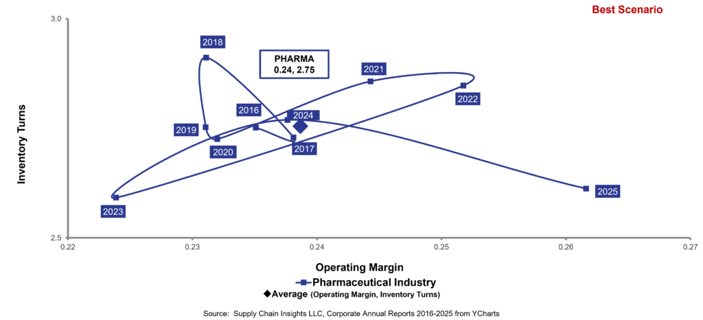
Let me use the pharmaceutical industry to illustrate the concept. In the period of 2016-2024, the pharmaceutical industry, as shown in Figure 1, averaged 24% margin and 2.75 inventory turns. (Note: this is the highest operating margin of any of the supply chain sectors.) (With these margins, isn’t it ironic that most of the pharmaceutical companies focus on reducing cost? And, are hamstrung by conventional thinking? And that no leader has built value networks to improve visibility and provenance?)
Table 1: Industry Sector Averages for Process-Based Industries for the Period of 2016-2025
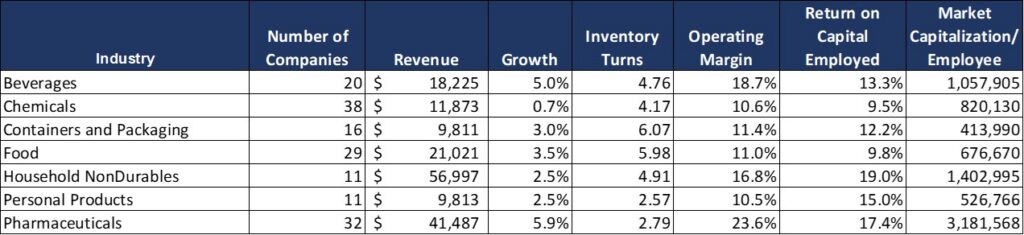
My first insight is that the averages do not tell the story. Market turbulence and industry potential are best represented by an orbit chart. In Figure 1, I share the pharmaceutical industry orbit chart for 2016-2025.
Figure 1. Pharmaceutical Orbit Chart at the Intersection of Operating Margin and Inventory Turns
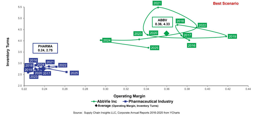
The winner of the Supply Chains to Admire for the pharmaceutical industry is AbbVie, with 36% margin and 4.33 inventory turns. Founded as a spin-off from Abbott Laboratories in 2012, the company has a newer take on supply chain.
The Company successfully navigated the massive Humira patent cliff while simultaneously scaling and launching newer therapies such as Skyrizi and Rinvoq. Those two biologic products now drive much of AbbVie’s growth. The supply chain was built on the principles of physician-patient networks, manufacturing redundancy, and the use of outside-in data.
Figure 2. Orbit Chart of AbbVie Comparison to the Pharmaceutical Industry for the period of 2016-2025
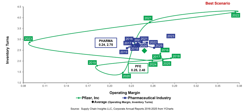
Now let’s take a look at Pfizer. In Gartner’s 2024 Life Sciences Supply Chain Top 25 research, Pfizer was ranked No. 20 in the global Top 25, achieving its fourth consecutive year in the ranking.
Both AbbVie and Pfizer manufacture biologics. Pfizer’s average operating margin is 25% with 2.48 inventory turns. They are less profitable than AbbVie and require more cash, but this is not the important story.
The magic of the technique lies in pattern recognition. Do you see how out of control Pfizer is compared to the AbbVie pattern? The large swings and gyrations are a reaction to variability in orders. (Order latency for a pharmaceutical company can be 30-90 days relative to consumption.) The Company’s supply chain thinking is old-school. During the period, Pfizer invested heavily in manufacturing analytics, advanced planning systems, AI-enabled forecasting, and control tower visibility.
The popular belief is that Pfizer is resilient. The large swings of this orbit chart tell me that the company is not. AbbVie is more resilient than Pfizer.
Figure 2. Orbit Chart of Pfizer Comparison to the Pharmaceutical Industry for the period of 2016-2025
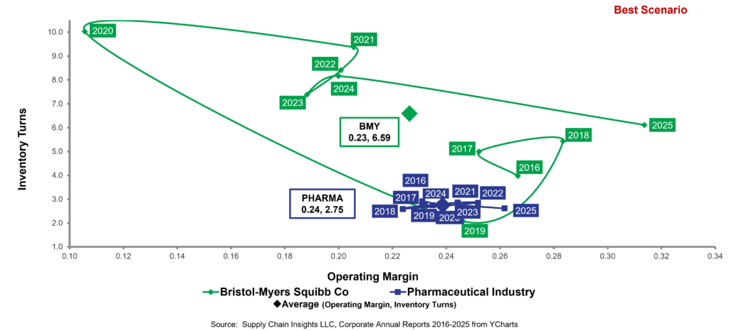
Now let’s take a look at Bristol Myers Squibb (BMS). The Company operates at a 24% operating margin and 2.75 inventory turns, but YOWZA, take a look at the swings. The Company specializes in oncology and cell therapy and is pushing to become more dominant in biologics. BMS has steadily invested in digital manufacturing, serialization, AI-enabled forecasting, and integrated planning systems. The BMS definitions are traditional, focusing on functional optimization. BMS is less resilient than Pfizer.
Figure 2. Orbit Chart of BMS Comparison to the Pharmaceutical Industry for the period of 2016-2025
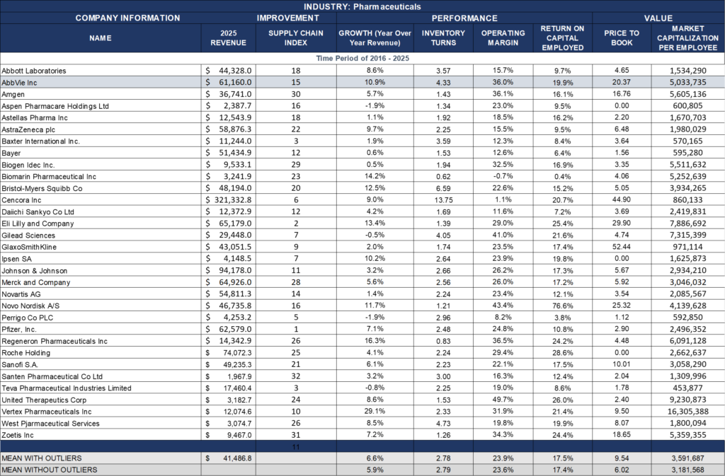
BMS and Pfizer are not outliers. I see the same pattern in AstraZeneca, Eli Lilly, J&J, Merck, Novartis, Novo Nordisk, etc. The lack of resiliency in the pharma sector at the intersection of operating margin and inventory turns, and growth and Return on Capital Employed (ROCE), permeates the industry. The industry is slow and reactive in a market that needs a patient-centric, responsive supply chain.
I am firmly convinced that the answer is not more traditional ERP and APS deployments. The demand latency and market characteristics require a redefinition that is only possible today through new AI techniques and redefining the first-principles redefinition of planning. A company steeped in tradition needs to question what are widely heralded as best practices to drive improvement.
I think it requires recognizing flow patterns across product categories, redefining demand management to focus on flow, designing networks for those flows, using market data to drive a balanced scorecard, and implementing bi-directional orchestration. It starts with redefining our relationship with data to build the semantic layer and to use market data in the planning master data layer. I explain some of these concepts in greater detail in my Handbook of Outside-in Planning.
So you might say, “What is the value?” Why should we change? These large swings are indicative of a reactive, not a responsive company. A focus on functional optimization and supply-centric strategies drives this pattern.
Summary
In closing, I want to say a prayer for all of my friends in flood-torn and fire-afflicted areas. It is raining on the East Coast, as fires rage on the West Coast. As I write this, I am finishing up 2 years of living in a hotel. What started as a fire in my house in August 2024 exposed the inadequacies of the US insurance system to me firsthand. You think that you are insured until you find out you are not.
The US home insurance system has been hijacked by financial markets and PE firms to prioritize balance-sheet performance over the delivery of promised outcomes.
I am fearful that this is also the case with Big Pharma. While I know many wonderful and caring people in this industry, the executive teams’ understanding of the requirements of a responsive supply chain to drive patient outcomes is lacking. Many executive teams think that the most effective supply chain is the efficient supply chain operating at the lowest cost. There is a strong belief that if you save money in the back office and pump it into the front office, a company will drive profitable growth. (I often think of my conversations with many executive teams.) Companies genuinely believe that functional excellence drives top performance. Risk management is focused on supply when the largest risk is in sensing and translating demand.
As I hear consultants talk about the autonomous supply chain, I shudder. The image below of a Waymo car zooming headfirst into a flood is apt. Please don’t WAYMO my pharmaceutical supply chain. Too many lives are at stake. We need to focus on responsiveness and flow alignment of cycles first.

Next week, I will be at Kinexions reporting on the focused work to redefine the semantic layer of planning, and attending Opticon, discussing the promise of AI-native network design technologies. If you are attending either of these events, I encourage you to reach out so we can share insights and explore potential collaborations. I am sure we will have a great conversation, but be forewarned, don’t try to WAYMO my supply chain.
For additional reading: Orbit charts, and why you should use them – Michel Baudin’s Blog